Heart of England FA – Kicking off in a new direction with a striking identity.
Visual Identity
Logo Design
Branding
Guidelines
Graphic Design
Illustration
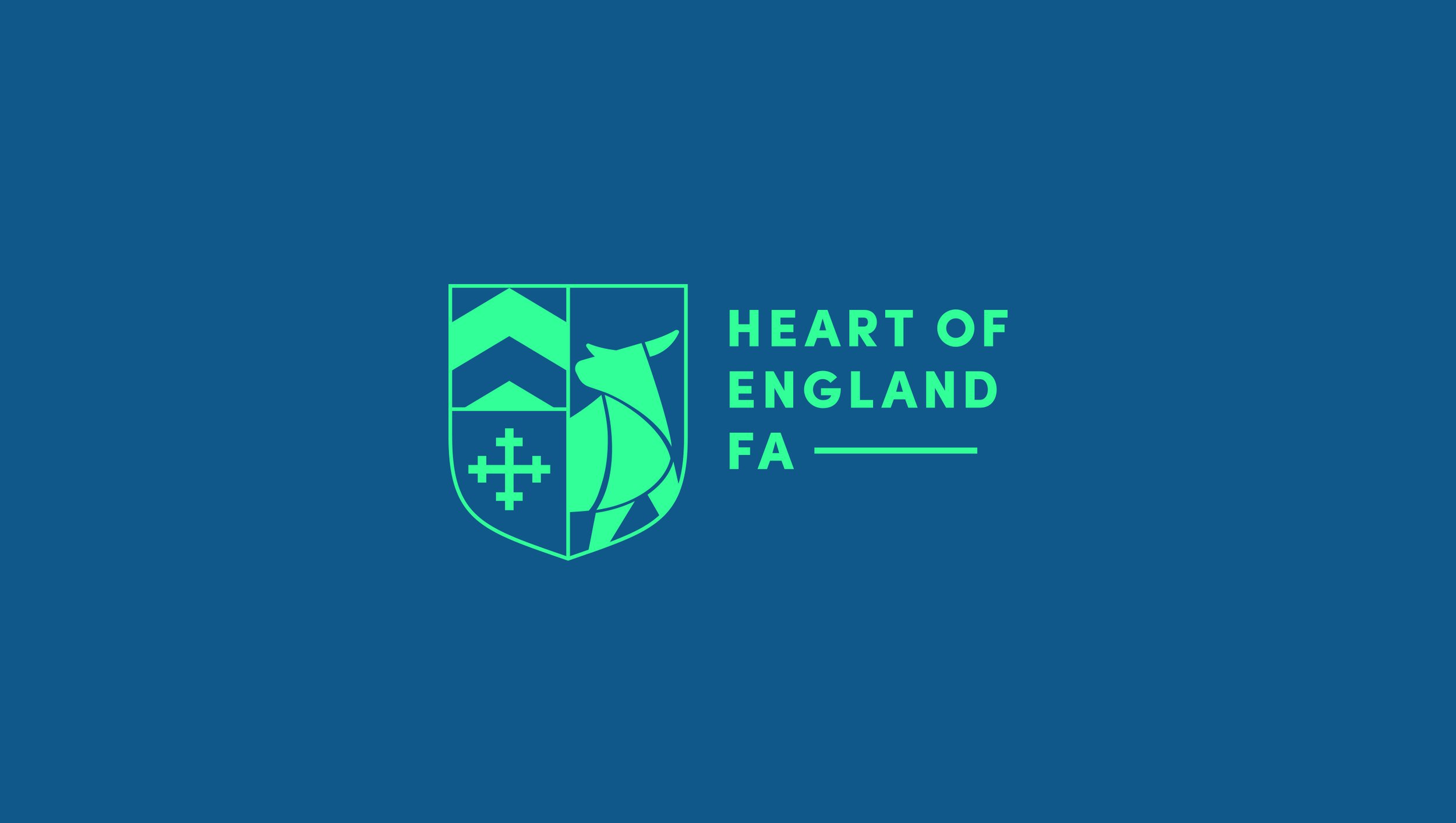
A fresh new look to celebrate the expansion of the Central England Football Association that encompasses 4 neighbouring counties. Combining bold simplicity and heritage to create a brand that is looking firmly into the future.
Studio.rh set out to create a heritage inspired crest that would express the individual identities of the counties, whilst bringing them all together under a new banner. Careful research was carried out to deconstruct each counties flag and identify the key visual elements to carry forward into the new design. The focus on football was clearly identified by implementing a shield device, heavily influenced by football shirt emblems, which was used to integrate the icons.
The final crest design infuses crisp lines with geometry and iconography for a distinctive and minimalist design icon. Supporting elements were created in the form of symbols taken from hand drawn tactical boards, bringing a human touch that complimented and broadened the identities language whilst expressing visual links to the sport.