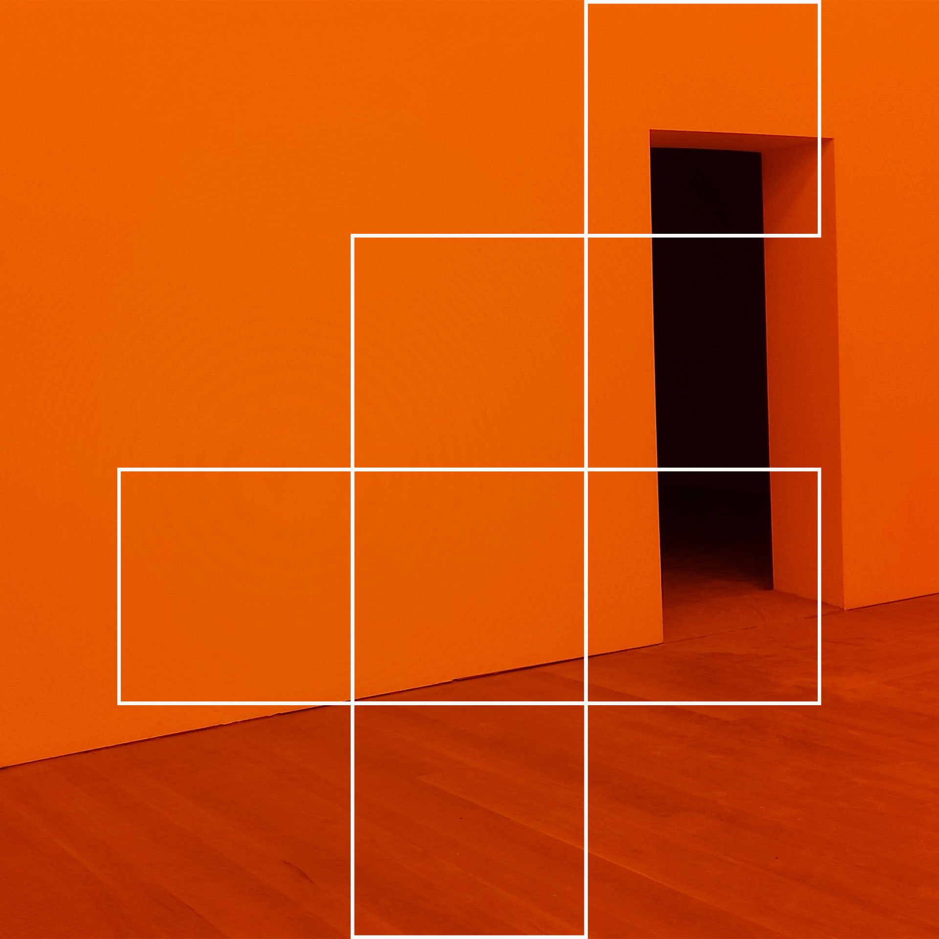
Four+ – Four is the magic number for this grid based visual identity.
Visual Identity
Logo Design
Branding
Guidelines
Graphic Design
Presentation Design
Based in the Cayman Islands, FOUR+ has a wealth of experience spanning almost two decades in providing businesses support for 360 marketing, human resources and business operations. They collaborated with Studio.rh to create a focussed identity that captures the brands extensive services and adaptability.
The creative concept is centred around a four sided “building block” grid format that was conceptualised to represent the bespoke service packages that FOUR+ offers, whilst the grid icon also encompasses the letter ‘f’ and the plus symbol. Combining this with a boldly uplifting colour palette and an expressive pattern system that elevates the final identity and creates an inspiring and distinctive brand image.


