FarGo – Creating a vibrant identity for a bustling creative community.
Brand Identity
Voice + Tone
Creative Direction
Environmental Design
Social Content
Brand Guidelines
Presentation Design
Advertising + Marketing
Print + Publication
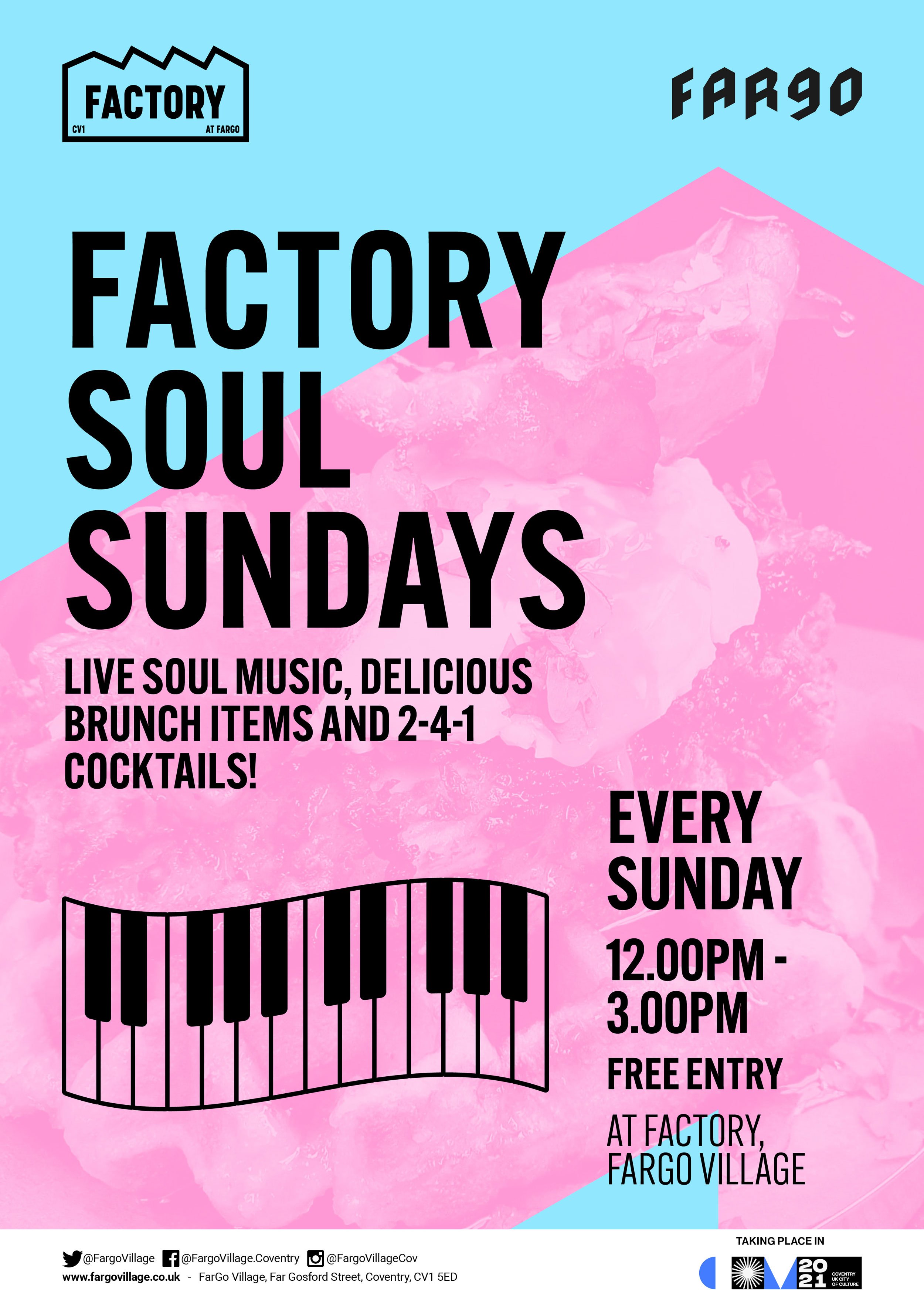
Event Promotions
Way-finding + Signage
FarGo Village is a vibrant hub of creative businesses, independent retailers and food and drink specialists. Over the years we’ve developed a close working relationship in providing creative services for their many events, festivals, way-finding signage and marketing.
Our long working partnership allowed me to become very familiar with the brand, so when I approached them with some areas I felt would benefit from a refresh, they were eager to get things moving. The goal was to create a clean and fresh image that would act as a canvas to house the many identities of retailers and events within village, but also something that would stand alone as a bold and vibrant identity.
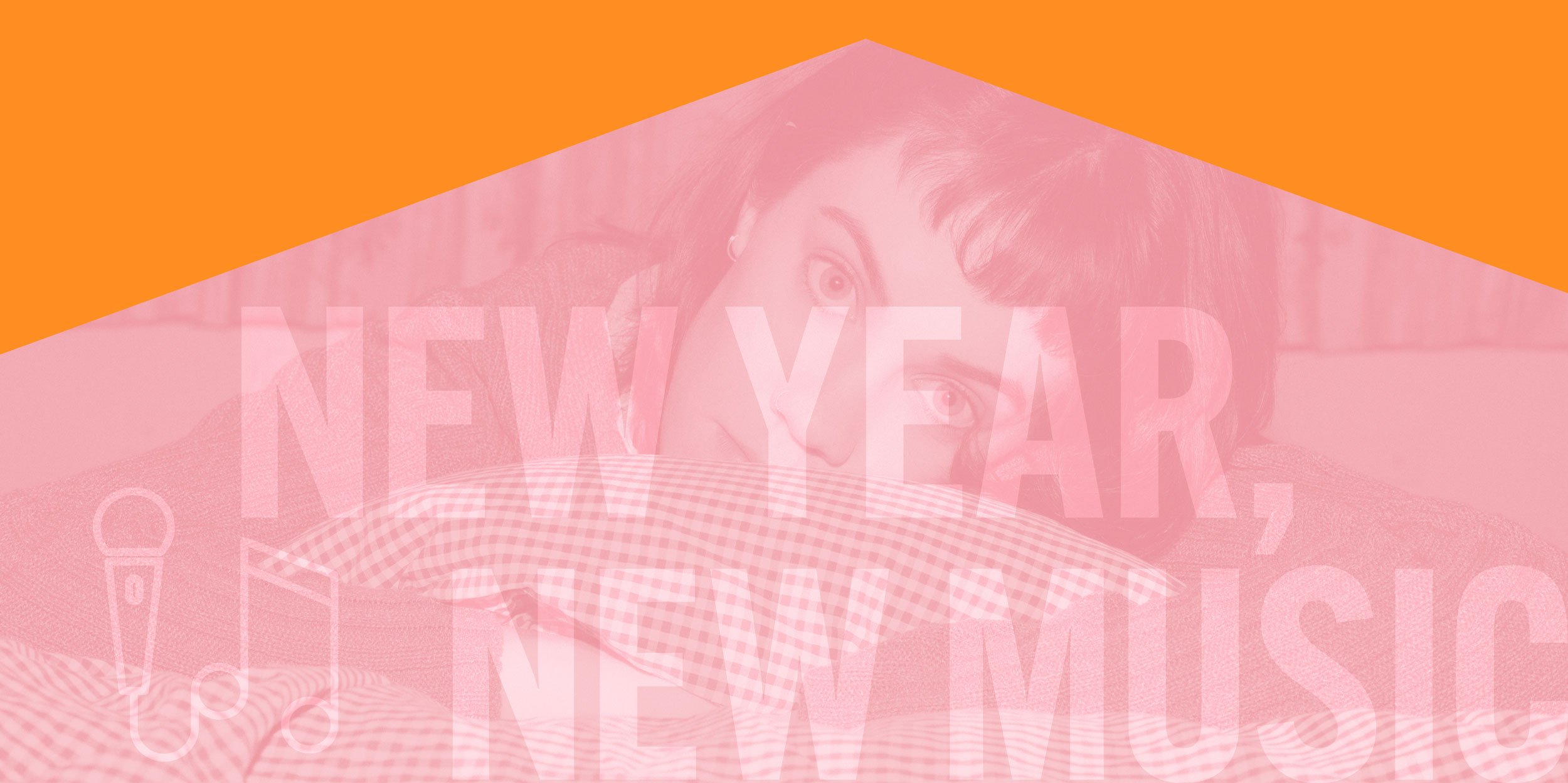
FarGo’s visitors cover a broad demographic seeking a fun, vibrant and inclusive space, the concept of inviting people to ‘Get Closer To FarGo’ was developed, this lead to the development of a graphic system that zoomed in close to the logo letterforms and cropped them to create interesting and abstract layouts, which became our canvas.
The original logo was freed up and refined using a precise geometric grid, ensuring each letterform was balanced. A bold broad colour palette to accompany the flagship brand yellow was developed alongside a suite of minimalist icons, designed to individually brand each event. Afterwards, I worked closely with the team to familiarise them with the correct usage and tone of voice for applying the identity to their communications going forward.
The identity roll-out encompassed everything from printed and digital online marketing materials, social media templates, way-finding and site signage, events branding and overseeing the update of their website.